“Drawing Your Own Path”: Art & Meditation

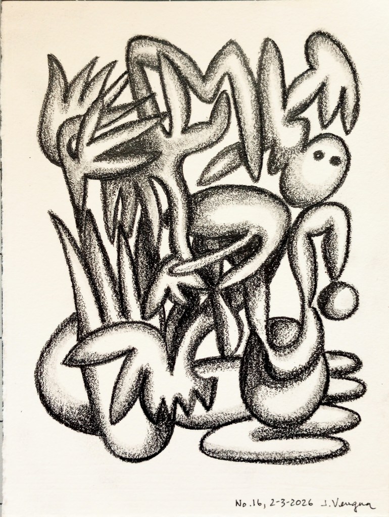
A few years back (before the Covid-19 pandemic began) I subscribed to receive daily drawings from John F. Simon, Jr. This was back when I was still feeling connected with the old days of blogging (more on that later). This was also before I knew that he had a book on drawing as meditation, called Drawing Your Own Path.

At some point, I moved on, and let go of the subscription. More recently, though, I learned about his book, and I also noted that his background in meditation had a connection to Buddhist Geeks (Vince Fakhoury Horn), a group I feel an affinity with. Maybe I will also check out Simon’s online Drawing Bee community drawing sessions.

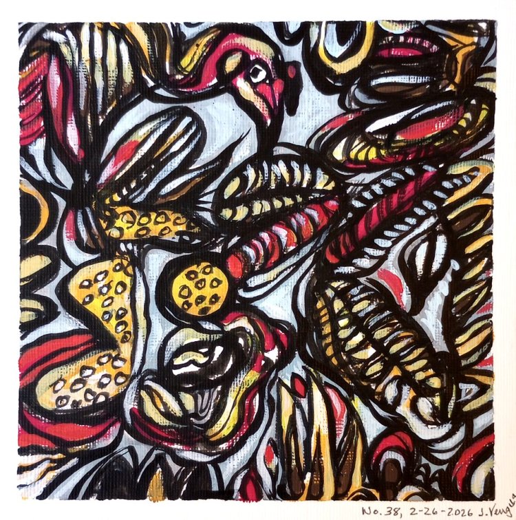
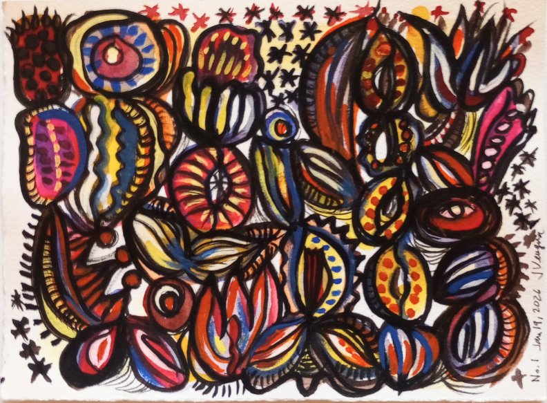
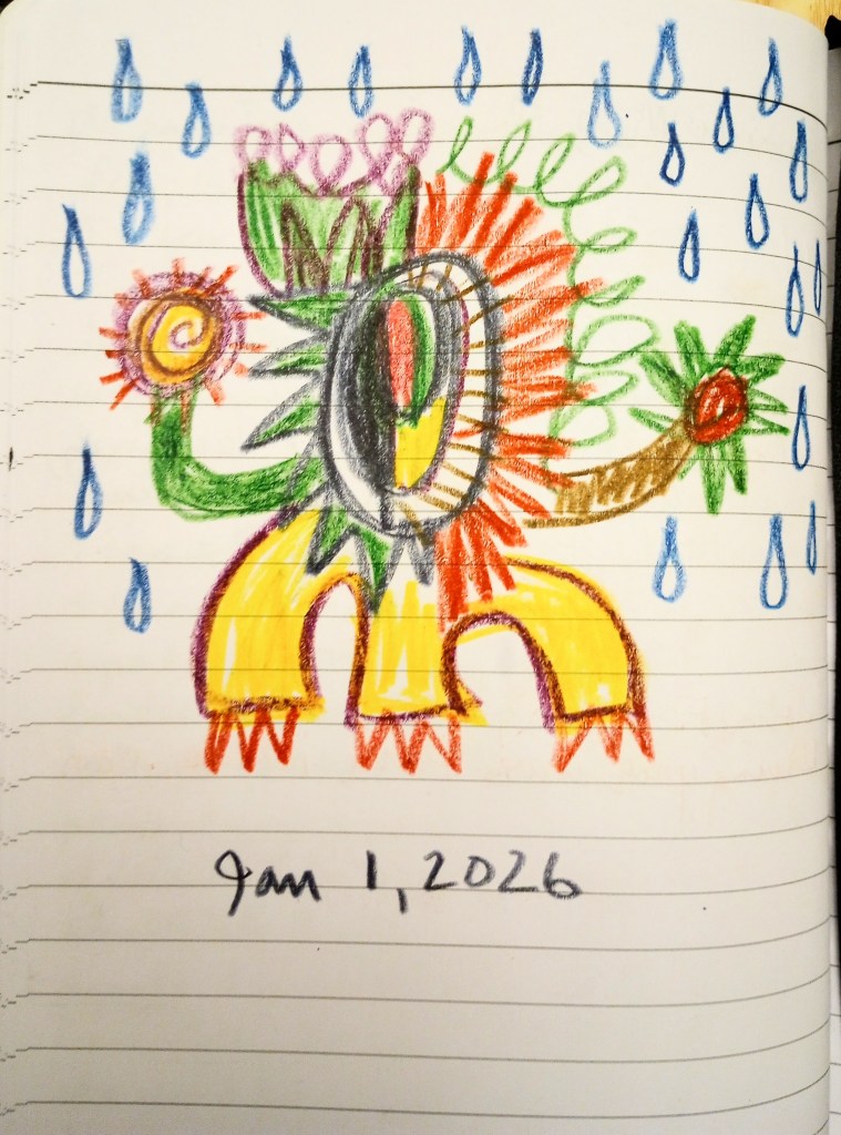
Here is my first daily drawing, based on Simon’s first exercise from his book. It’s also my first drawing of 2026, which is already starting off as a challenging year–can you tell?:

I did this without any thinking or planning whatsoever, and I think it illustrates the irony I”m feeling about the New Year. I’m heading off to physical therapy now . . .

Changes

Here we are at Winter Solstice, and the season seems to be urging me to make some changes. Some of those changes will be happening her on this website. I’ll be going back to selling my art again (I took two years off) on this site. I will also be changing the pages setup, categorizing my work by type, rather than by year created. So please excuse the “mess” if things seem a little disorganized. This shouldn’t take too long.

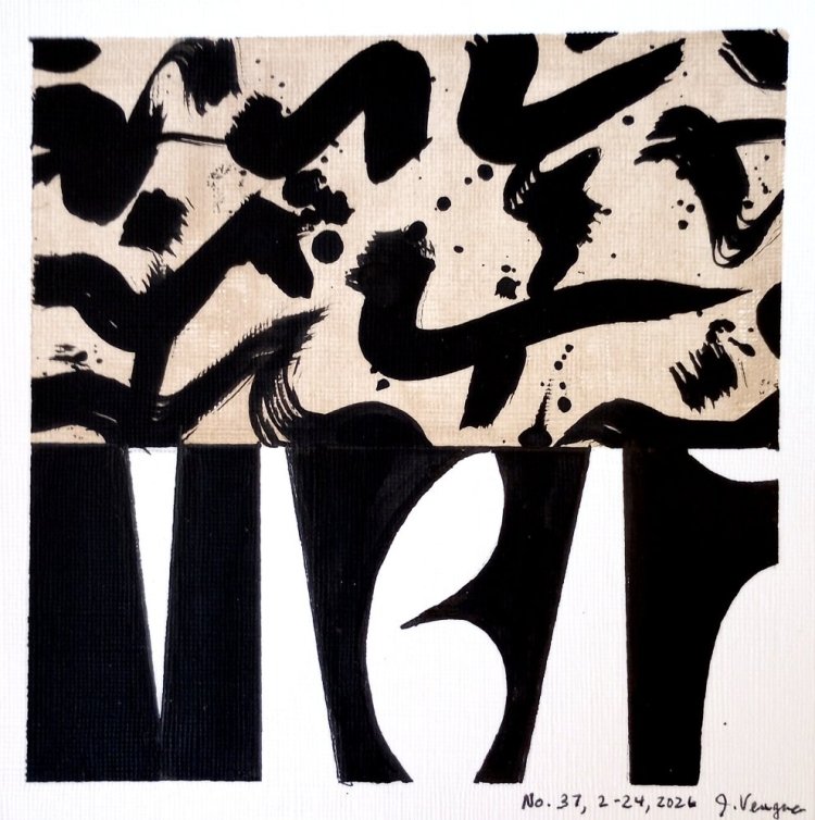
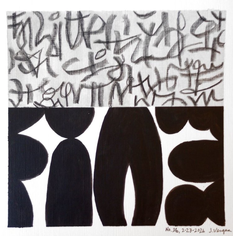
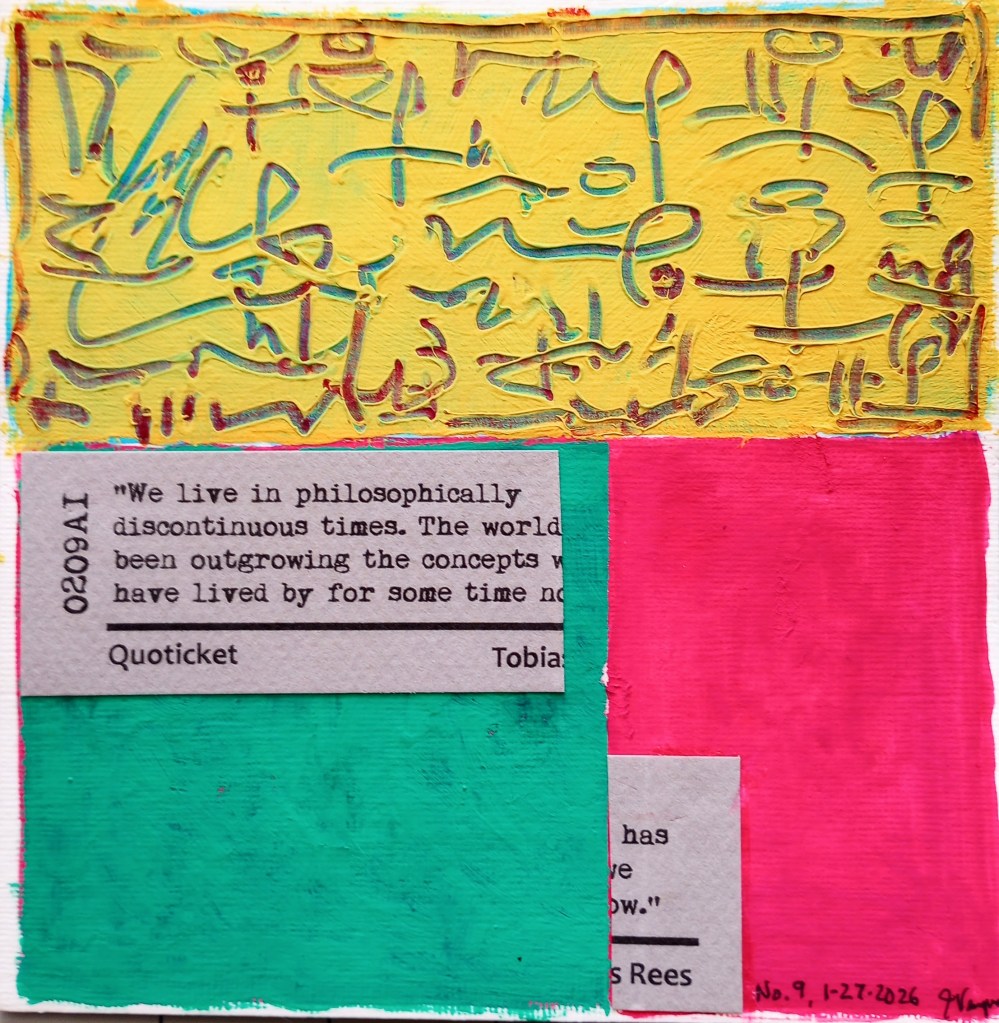
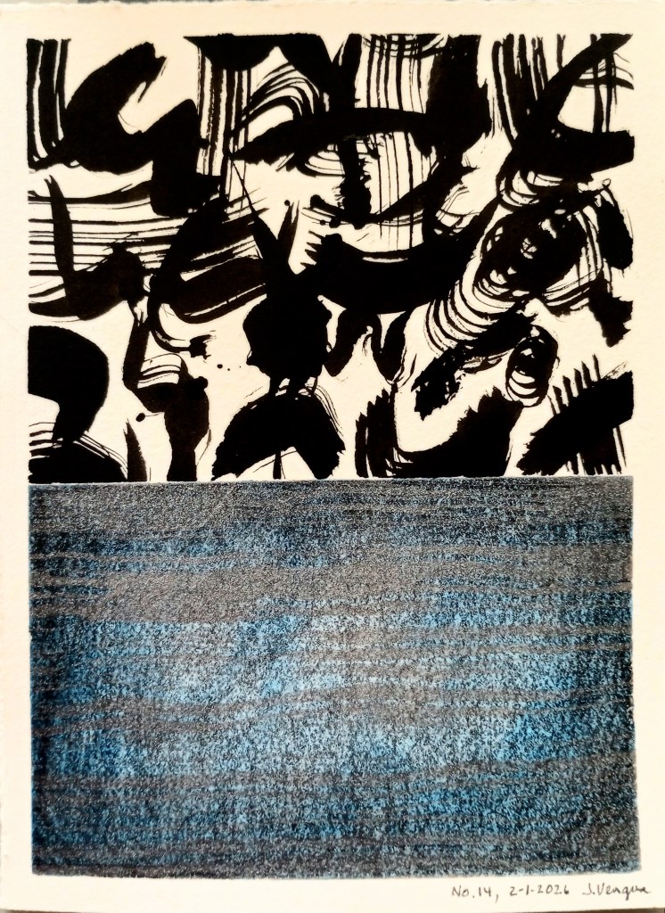
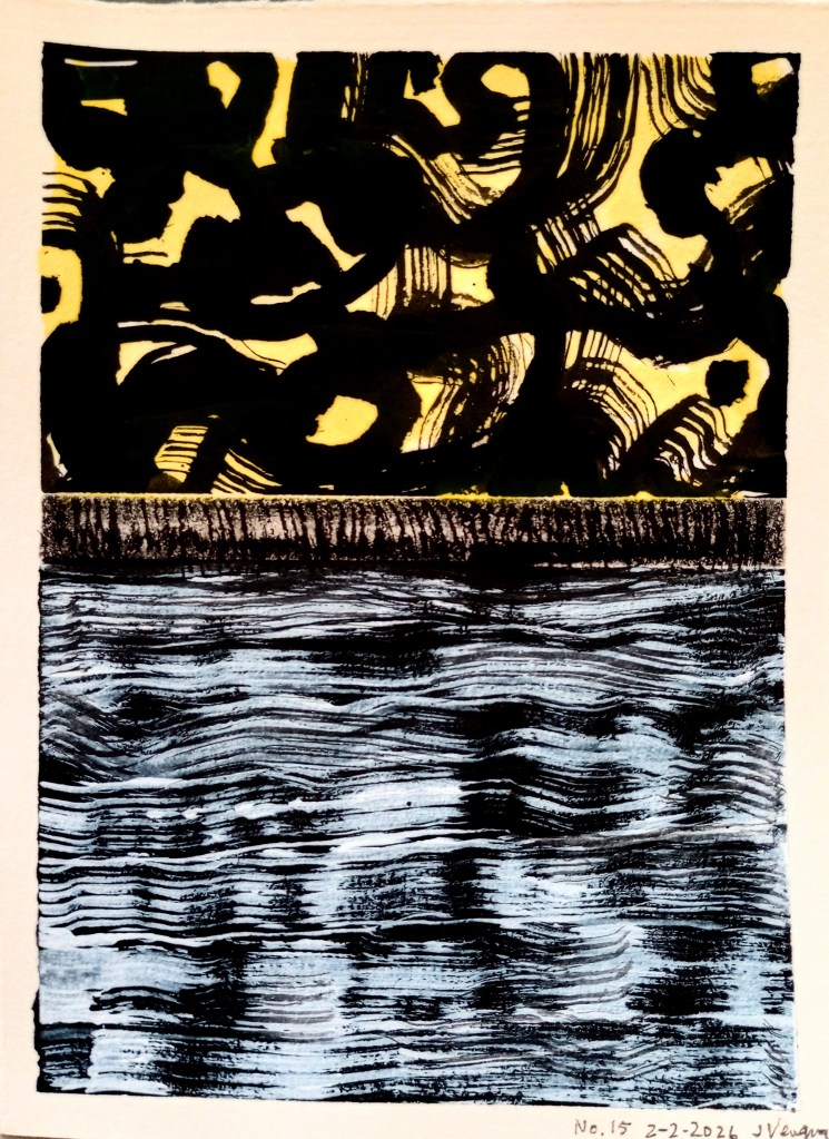
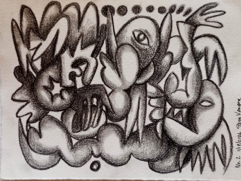
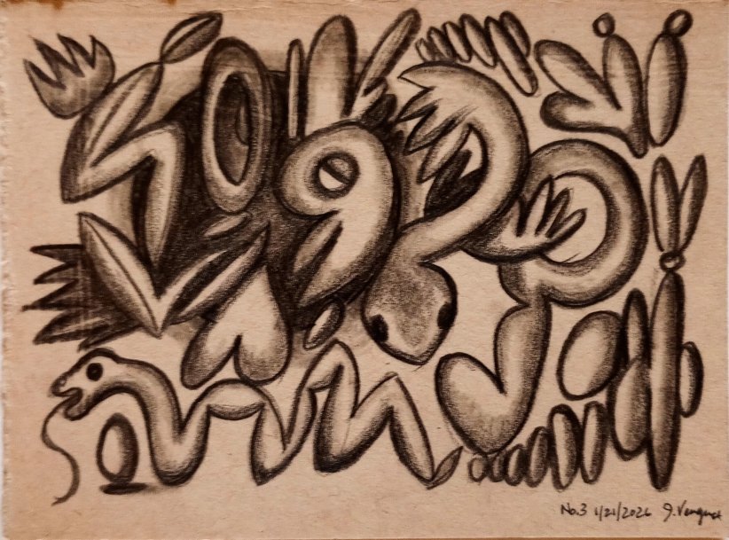
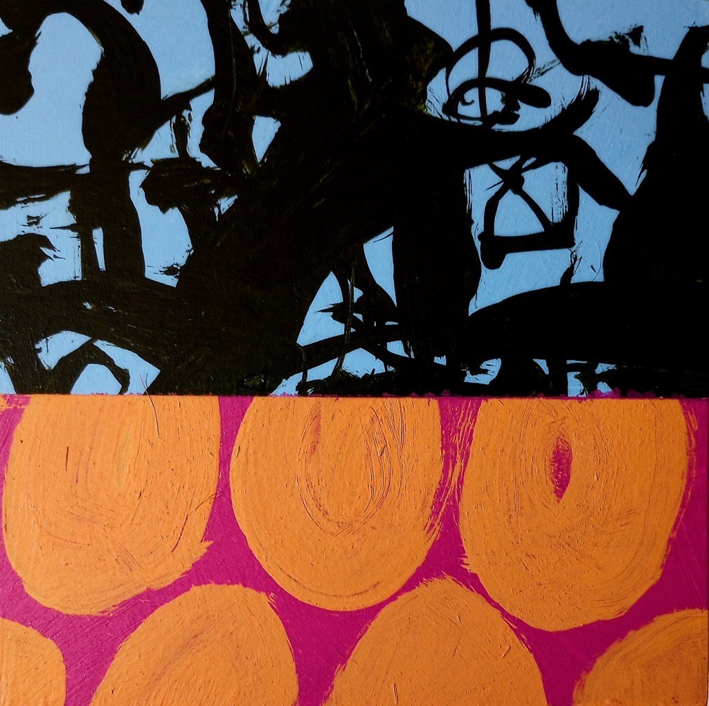
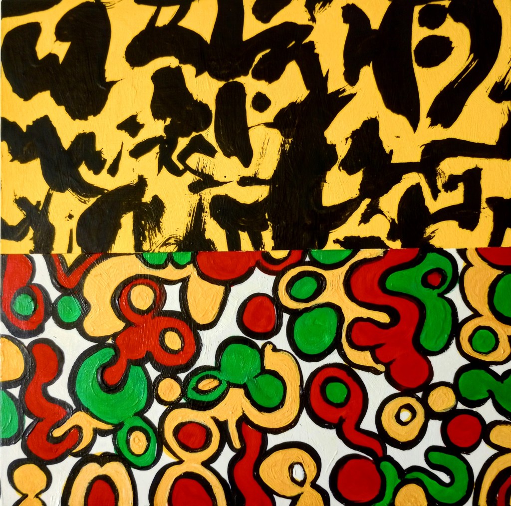
Here are two asemic paintings that I’ve done recently:

Behind the Scenes

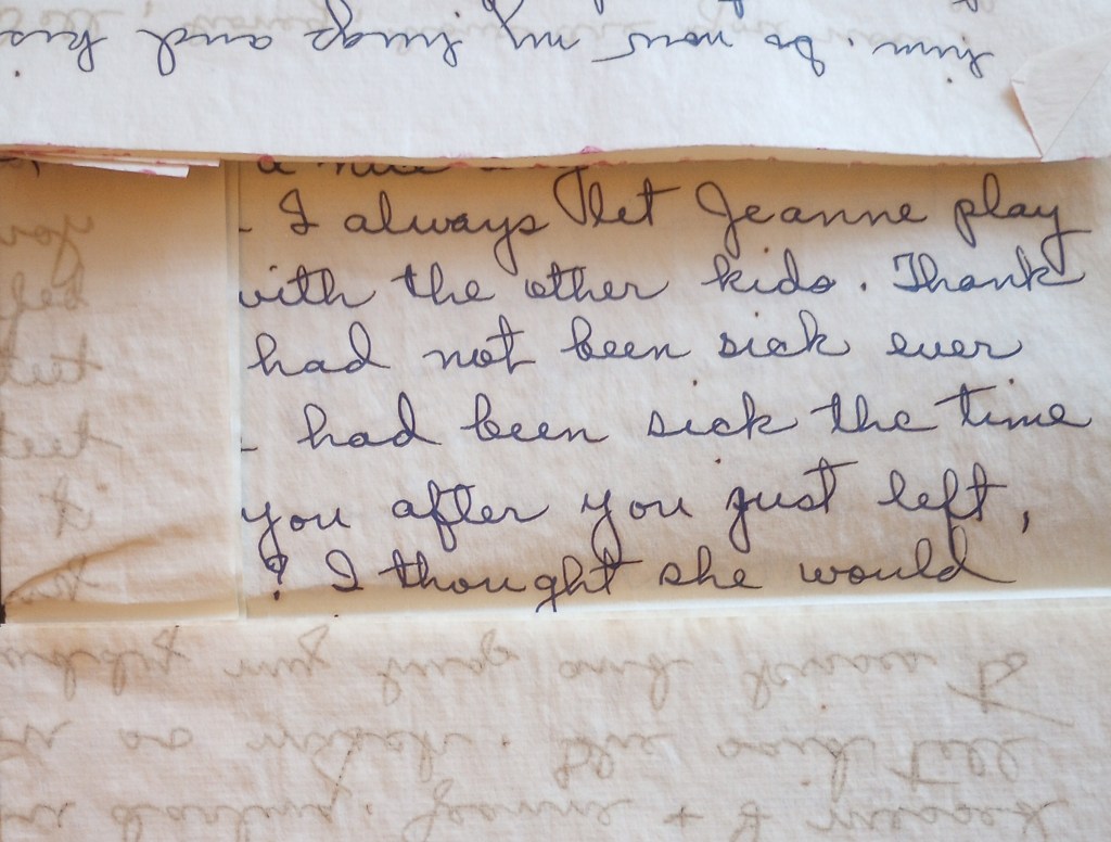
I’ve got a new post on Substack: Behind the scenes, there is research, organizing, scanning, and filing. Also: Catalina Africa, Steve Silver, Kathryn Vercillo, Kirk Gordon; Open Reel Ensemble, and Shimon Hoshino.

Image shows boxes of letters and old airmail envelopes.

Filipino Labor

Check out my article “Under Pressure” on Eulipion Outpost. Dad writes a May Day letter revealing his “disgust” at labor conditions on an MSTS ship in 1959. Also, Filipino labor strikes, history, art, and music. Links: Joe Livernois, Anthropic Settlement, Kazu Haga, Lynda Barry, Sam Wallman, Queen w/David Bowie, & Steffi Barthel. Eulipion Outpost focuses on intersections of history, culture, and art.

Small acrylic painting on wood

“Sploosh 2025.” I haven’t painted in acrylics for several years now. But I saw an old painting I had started long ago on a recycled panel I found at Good Will. I felt the previous version was “timid,” and decided to paint over it–just had fun with it.

Abstract painting in bright, primary colors with small rounded shapes interspersed with yellow stripes and a few squiggly black outlines. Very pop-arty.

The Editor of Texts

As an “editor” of texts, I recently replied to a post by a friend about the issue of retaining two spaces after a period–or not, as prescribed by the Chicago Style Manual No. 17. I weighed in on that, favoring the single space because it is now considered “official.”

Someone noted that “it’s all bullshit,” and I realized that I basically agree. But here is the irony of my position as an editor–that I uphold all these standards through my “service.” And I will continue to do that, as part of my job. (Note: there have been times when I have recommended that a client ignore Chicago [or whatever] Style rules, especially when it comes to capitalization).

Yet. Today, after receiving a very nice reply to my Substack note from the artist/designer Paul Soulellis, and looking up his website, I saw that he had written: “Typography and power are intimately entangled.” And I think that applies to editing and type spacing, and all the visual elements that go into written language.

So that’s just circulating around in my brain right now, even as I prepare some Mail Art to go . . .

Berry Ink Asemic

A friend gave me big sheets of old Arches watercolor paper. After doing mostly small art for several years, I decided to try doing something larger, though I have no room in this cottage for this kind of thing. Oh, well. It felt good to stretch out, anyway. Berry Ink #Asemic, 24 x 22 in.

Black ink asemic writing painted over a purple-blue background with the bottom 1/3 of the image in red berry ink, with splotchy English alphabet letters running horizontally across the image.

Mail Art / Arte Povera

In my latest issue of Eulipion Outpost, I write about Arte Povera. Some aspects of mail art also relate to that art movement. I wrote the following in a previous issue of Eulipion Outpost, but only recently thought of it in terms of Arte Povera:

Receiving all this correspondance3 art has been a kind of “immersion” learning process in an art practice that has its roots and influences in Dada, Oulipo, Pop Art, and Fluxus—but it also seems to be a wide-ranging and tricksterish art movement that I’ll probably never know in depth. So I’m just starting at a little corner and sort of nibbling on that.

There are a few aspects of mail (or correspondence) art that I gravitate towards, and they are:

  • art that, at its basis, is about community, gifting, and sharing (as opposed to monetary and patron-centered)
  • art as play and even choreography and “dance” (Ray Johnson’s “correspondance”)4
  • art that is subversive and anti-elitist, operating (mostly) outside mainstream art institutions
  • art that relies mostly on the material at hand, transforming it and circulating it as artistic expression
  • art that anyone can do, and does not require a lot of expense (i.e., framing, gallery and promotional costs, membership fees, etc.)
  • art as both relational and flexible, beginning one-on-one, but potentially expansive to a great degree; it can be utterly simple, or quite complex.