I’ve got a new post on Substack: Behind the scenes, there is research, organizing, scanning, and filing. Also: Catalina Africa, Steve Silver, Kathryn Vercillo, Kirk Gordon; Open Reel Ensemble, and Shimon Hoshino.

Art and Writing
I’ve got a new post on Substack: Behind the scenes, there is research, organizing, scanning, and filing. Also: Catalina Africa, Steve Silver, Kathryn Vercillo, Kirk Gordon; Open Reel Ensemble, and Shimon Hoshino.
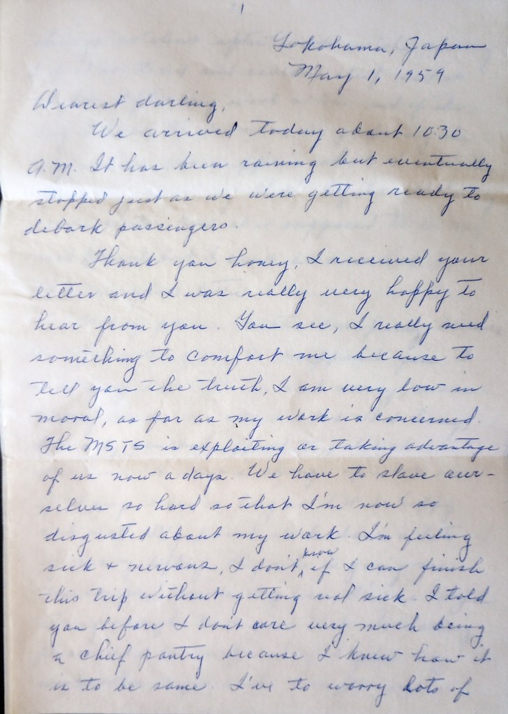
Check out my article “Under Pressure” on Eulipion Outpost. Dad writes a May Day letter revealing his “disgust” at labor conditions on an MSTS ship in 1959. Also, Filipino labor strikes, history, art, and music. Links: Joe Livernois, Anthropic Settlement, Kazu Haga, Lynda Barry, Sam Wallman, Queen w/David Bowie, & Steffi Barthel. Eulipion Outpost focuses on intersections of history, culture, and art.
“Sploosh 2025.” I haven’t painted in acrylics for several years now. But I saw an old painting I had started long ago on a recycled panel I found at Good Will. I felt the previous version was “timid,” and decided to paint over it–just had fun with it.

As an “editor” of texts, I recently replied to a post by a friend about the issue of retaining two spaces after a period–or not, as prescribed by the Chicago Style Manual No. 17. I weighed in on that, favoring the single space because it is now considered “official.”
Someone noted that “it’s all bullshit,” and I realized that I basically agree. But here is the irony of my position as an editor–that I uphold all these standards through my “service.” And I will continue to do that, as part of my job. (Note: there have been times when I have recommended that a client ignore Chicago [or whatever] Style rules, especially when it comes to capitalization).
Yet. Today, after receiving a very nice reply to my Substack note from the artist/designer Paul Soulellis, and looking up his website, I saw that he had written: “Typography and power are intimately entangled.” And I think that applies to editing and type spacing, and all the visual elements that go into written language.
So that’s just circulating around in my brain right now, even as I prepare some Mail Art to go . . .
A friend gave me big sheets of old Arches watercolor paper. After doing mostly small art for several years, I decided to try doing something larger, though I have no room in this cottage for this kind of thing. Oh, well. It felt good to stretch out, anyway. Berry Ink #Asemic, 24 x 22 in.

In my latest issue of Eulipion Outpost, I write about Arte Povera. Some aspects of mail art also relate to that art movement. I wrote the following in a previous issue of Eulipion Outpost, but only recently thought of it in terms of Arte Povera:
Receiving all this correspondance3 art has been a kind of “immersion” learning process in an art practice that has its roots and influences in Dada, Oulipo, Pop Art, and Fluxus—but it also seems to be a wide-ranging and tricksterish art movement that I’ll probably never know in depth. So I’m just starting at a little corner and sort of nibbling on that.
There are a few aspects of mail (or correspondence) art that I gravitate towards, and they are:
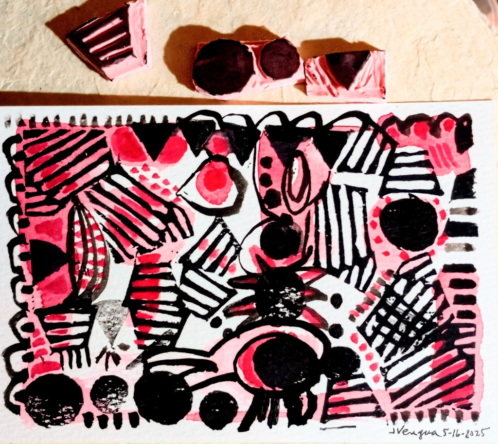
Stamp-printed postcard art. Ready to go (I think). . .


You must be logged in to post a comment.